

How To Create A Popup In React Js
In this blog we will learn how to create a custom PopUp Component in React. Our Focus will be on creating a Reusable Component that we can Invoke from any of the component entire our project.
So Let's follow the steps to create this component.
Step 1: Create a file named custom-popup.module.css with following code
| 1 2 3 4 5 6 7 8 9 10 11 12 13 14 15 16 17 18 19 20 21 22 23 24 25 26 27 28 29 30 31 32 33 34 35 36 37 38 39 40 41 42 43 44 45 46 47 48 49 50 51 | . overlay { visibility : hidden ; opacity : 0 ; position : fixed ; top : 0 ; bottom : 0 ; left : 0 ; right : 0 ; background : rgba ( 0 , 0 , 0 , 0.7 ) ; transition : opacity 500ms ; } . popup { margin : 70px auto ; padding : 20px ; background : #fff; border - radius : 5px ; width : 30 % ; position : relative ; transition : all 5s ease - in - out ; } . popup h2 { margin - top : 0 ; color : #333; font - family : Tahoma , Arial , sans - serif ; } . popup . close { position : absolute ; top : 20px ; right : 30px ; transition : all 200ms ; font - size : 30px ; font - weight : bold ; text - decoration : none ; color : #333; } . popup . close : hover { cursor : pointer ; color : #000; } . popup . content { max - height : 30 % ; overflow : auto ; } @ media screen and ( max - width : 700px ) { . popup { width : 70 % ; } } |
In this file we have created all the relevant css that will be needed in our component
Step 2: Now create Popup Component with name CustomPopup.jsx with following code
| 1 2 3 4 5 6 7 8 9 10 11 12 13 14 15 16 17 18 19 20 21 22 23 24 25 26 27 28 29 30 31 32 33 34 35 36 37 38 39 40 41 42 | import { useEffect , useState } from "react" ; import popupStyles from "./custom-popup.module.css" ; import PropTypes from "prop-types" ; const CustomPopup = ( props ) = > { const [ show , setShow ] = useState ( false ) ; const closeHandler = ( e ) = > { setShow ( false ) ; props . onClose ( false ) ; } ; useEffect ( ( ) = > { setShow ( props . show ) ; } , [ props . show ] ) ; return ( < div style = { { visibility : show ? "visible" : "hidden" , opacity : show ? "1" : "0" } } className = { popupStyles . overlay } > < div className = { popupStyles . popup } > < h2 > { props . title } < / h2 > < span className = { popupStyles . close } onClick = { closeHandler } > & times ; < / span > < div className = { popupStyles . content } > { props . children } < / div > < / div > < / div > ) ; } ; CustomPopup . propTypes = { title : PropTypes . string . isRequired , show : PropTypes . bool . isRequired , onClose : PropTypes . func . isRequired } ; export default CustomPopup ; |
This will be our component code where we are maintaining the popup opening and closing states on various events. Also we are using propTypes Module to validate our Props. make sure you have installed prop-types module using following npm command
| npm install prop - types -- save |
Step 3: Invocation from another component
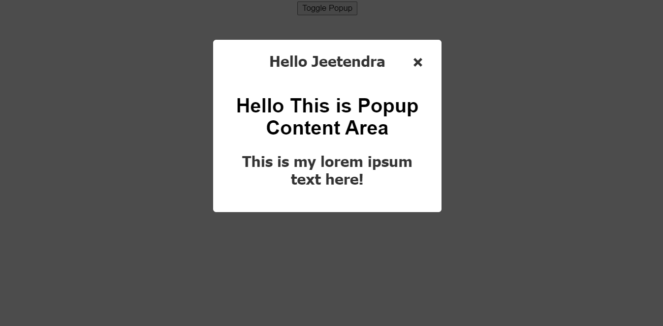
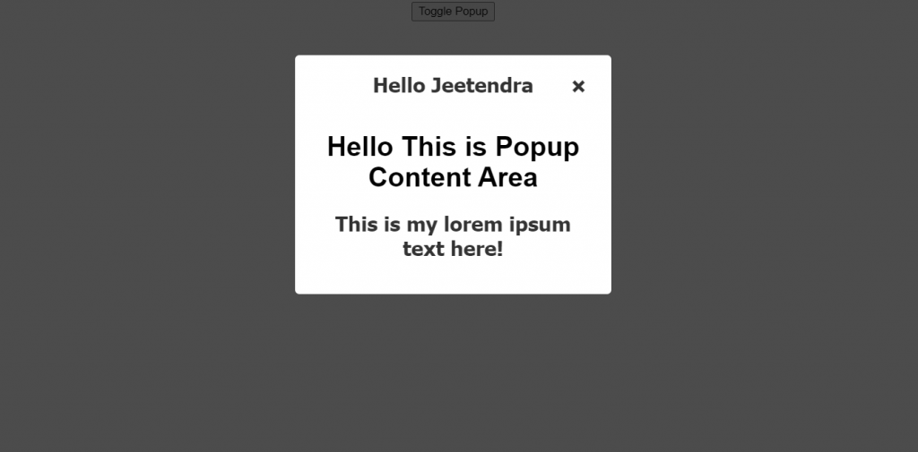
| < CustomPopup onClose = { popupCloseHandler } show = { visibility } title = "Hello Jeetendra" > < h1 > Hello This is Popup Content Area < / h1 > < h2 > This is my lorem ipsum text here ! < / h2 > < / CustomPopup > |
It will need 3 props :
1: onClose – need a handler to do some activity after close click in popup itself
2: show – pass the visibility of popup suing boolean true or false
3: title – provide the popup title
and Inside the you may pass any valid JSX that you want to render as content of popup
If you need a complete example how can we do utilise this PopUp Component then you may look into following code
| 1 2 3 4 5 6 7 8 9 10 11 12 13 14 15 16 17 18 19 20 21 22 23 24 25 26 27 28 | import { useState } from "react" ; import CustomPopup from "./CustomPopup" ; import "./styles.css" ; export default function App ( ) { const [ visibility , setVisibility ] = useState ( false ) ; const popupCloseHandler = ( e ) = > { setVisibility ( e ) ; } ; return ( < div className = "App" > < button onClick = { ( e ) = > setVisibility ( ! visibility ) } > Toggle Popup < / button > < CustomPopup onClose = { popupCloseHandler } show = { visibility } title = "Hello Jeetendra" > < h1 > Hello This is Popup Content Area < / h1 > < h2 > This is my lorem ipsum text here ! < / h2 > < / CustomPopup > < / div > ) ; } |
Hurray we are all set, It will look like following screenshot
Thats it for this blog. you may reach out to me in case you have any doubts and suggestions please let me know in comments section.
Thanks

How To Create A Popup In React Js
Source: https://www.w3school.info/2021/07/09/how-to-create-a-custom-popup-component-in-react/
Posted by: crenshawsleaspold1954.blogspot.com
0 Response to "How To Create A Popup In React Js"
Post a Comment